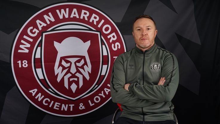
Wigan Warriors general manager Kris Radlinski: "There are actually some really cool things that have come out of here, and everything we're trying to push for - certainly with the badge and in 2021 - is probably a different direction than what we've done in recent years"
Friday 30 October 2020 17:19, UK
There are perhaps few people at present who understand what it means to be a Wiganer more than Kris Radlinski.
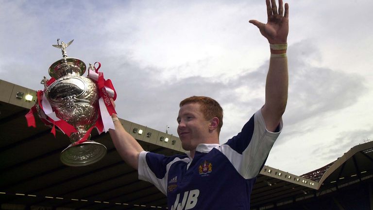
As well as being born in Wigan, the 44-year-old has spent his entire rugby league career embedded in the community too, from his formative years with two of the town's renowned amateur clubs St Judes and St Patricks to scaling the heights of the professional game in a 13-year career wearing that iconic Cherry and White jersey.
Radlinski, now general manager of Wigan Warriors, knows there is more to this area on the western fringe of Greater Manchester than just rugby league though - something which was kept very much in mind when it came to the club designing a new badge.
Indeed, the warrior on the crest is an embodiment of an aspect he believes best represents the people of the town - even if it took a colleague who hails from Warrington to point it out.
"It was an internal meeting that a colleague pointed out there was something about a Wiganer, something in their eyes - a defiance, a determination and a desire to prove people wrong," Radlinski told Sky Sports.
"This created an entirely new narrative for us to run with and you could see at the time the designers were really enthused by this story.
"Bearing in mind I've looked at this every day for the last six months, the more I do, I look into this guy's eyes. I'm looking straight through this guy's eyes into his heart and soul, and that's the eyes of every single Wiganer.
It was an internal meeting that a colleague pointed out there was something about a Wiganer, something in their eyes - a defiance, a determination and a desire to prove people wrong.
"Once we saw it, we all though 'this is where we're going' and was probably the vision we had in mind."
Unveiled on Sunday evening, the new badge is a radical departure from the various adaptions of the Wigan town coat of arms which have adorned the shirt down the years.
As well as embracing the club's nickname in the logo for the first time - "There are many fans who don't like us being called 'Warriors'; we still get letters on that each day," Radlinski admitted - the design of the warrior is specific to Wigan history.
Hours of painstaking research by Stuart Watson and his design team at Nomad, the creative group which came up with the badge, led to them basing it on the Brigantes who lived across the North of England in pre-Roman conquest times.
There is the subtle inclusion of the club's 'WW' initials in the beard as well, plus the 1872 year of foundation and cherry and white hoops are incorporated too. The motto of 'Ancient and Loyal' and the shield from the current badge also carry over.
The question many fans might well ask is why change it all? But an audit of all clubs by Super League two years ago produced feedback which left Wigan in no doubt the crest needed modernising, with Radlinski being told by owner Ian Lenagan: "If we're going to do something, we're going to do something radical."
That has led to this new badge, produced in consultation with a cross-section of Warriors supporters, which Radlinski believes will better represent Wigan in the digital age and make the club more marketable both at home and beyond Super League.
"This badge is all we've known all our lives and I very often make reference to it when I'm signing players for the club, saying 'you represent everything that has gone before and everything moving forward'," Radlinski said.
There is something about Wiganers, we're different to everyone else.
"It's a very traditional club in that respect. We are going in with our eyes wide open in that respect, we know we're probably going to upset a few people.
"But the message we need to get across is we're doing it for the right reasons, we're doing it to make the club better, we're doing it to, in this modern digital age, inspire a new generation of fans to maximise the exposure on digital platforms and create new opportunities for us.
"Not just for the club to survive but thrive coming out of covid. We need to be rolling up our sleeves and not fear the challenges ahead but look forward with great anticipation and positivity."
Radlinski cited the fact the Warriors have been turned down by manufacturers for their plans to produce certain products due to the intricate nature of the traditional badge, which features 21,000 threads and costs £3.20 every time it is embroidered onto a garment, as another need for change.
The new logo is therefore easier to adapt for the new range of leisurewear and the home and change shirts for 2021, which are due to be launched shortly.
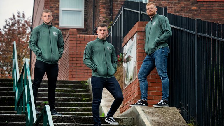
In a further nod to Wigan's culture beyond the 13-man code, photoshoots for those have already taken place at iconic sites in the town such as Wigan Pier - made famous by author George Orwell - and the Blind Steps, where Oasis photographed the artwork for their 1997 single 'D'You Know What I Mean?'.
The 2021 change kit will feature an adaption of the Wigan Casino night owl logo too in homage to the one-time hub of the Northern Soul scene as next year marks 40 years since the venue's closure, something which is further in keeping with Radlinski's vision.
"There are actually some really cool things that have come out of here, and everything we're trying to push for - certainly with the badge and in 2021 - is probably a different direction than what we've done in recent years," Radlinski said.
"There is something about Wiganers, we're different to everyone else."