Every NBA City Edition jersey ranked from worst to best
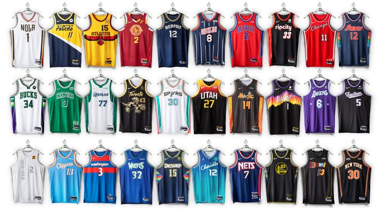
Winning championships is important, but so too is looking good every time you set foot on the hardwood. Here's a complete ranking of every new City Edition jersey, from the Atlanta Hawks to the Washington Wizards
Tuesday 2 November 2021 18:17, UK
On Monday, the NBA and Nike unveiled the 2021-22 City Edition jerseys, celebrating the 75th anniversary of the league on the date of its first game: the New York Knicks against the Toronto Huskies.
As always, this caused a stir on social media as basketball fans around the world analysed every tiny thread of detail and design to decide among themselves which teams have nailed it, and which teams have mailed it in.
Consequently, we couldn't resist compiling our own ranking of the City Edition jerseys from worst to best. It was a long and arduous task not taken lightly but ultimately worth it given the monumental catharsis we reached at the end. In this writer's opinion, we've got it bang on, with no arguments to be made to the contrary.
(No, of course not, please send any complaints with the size of text equal to your specific amount of rage and/or disgust).
Enjoy, or at least try to, and we'll see you down at the bottom with the masterpiece sitting at number one.
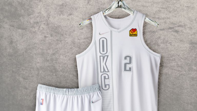
30. Oklahoma City Thunder
When The Beatles released the White Album in 1968 it was a landmark moment for music. When the Oklahoma City Thunder released their white City Edition jersey in 2021, everyone sighed.
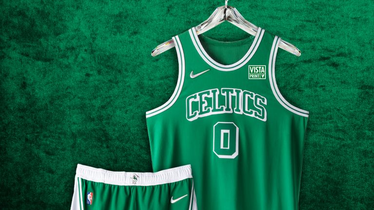
29. Boston Celtics
They've changed the font. Other than that, this is the same as every other Boston Celtics jersey in existence.
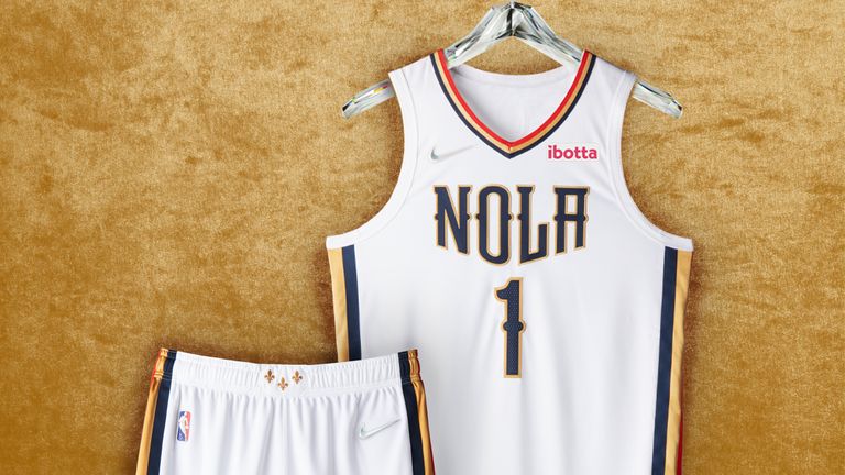
28. New Orleans Pelicans
The exact opposite of New Orleans as a city: plain, quiet, boring. Nobody is turning up at Mardi Gras in this and that is honestly a crying shame. Imagine what could have been, Pels fans.
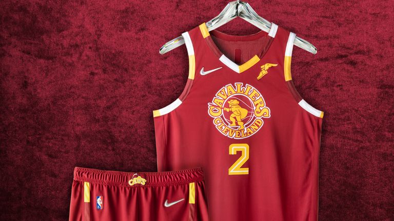
27. Cleveland Cavaliers
Cleveland are a super fun team at the moment. They've won four of their last six games. In the pace and space era, with every other team going small, they start three genuine 7-footers in Evan Mobley, Lauri Markkanen and Jarrett Allen. What's not to like?
Well, this, to be exact. Change the logo to LeBron' block on Andre Iguodala from the 2016 Finals and then we'll talk.
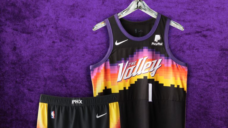
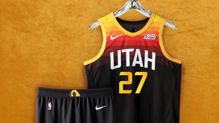
Tied 26. Phoenix Suns and Utah Jazz
Individually these are great jerseys, arguably two of the best on the list, but we saw them both last season. Sorry but I don't make the rules.
Oh no wait, I do, so here they are right near the back.
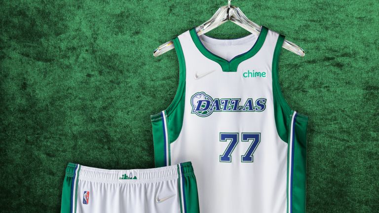
24. Dallas Mavericks
The Mavericks Twitter bio reads: "The vibes are immaculate." We regret to inform you they aren't. They just aren't. The retro cowboy hat is the only thing that saves this jersey.
23. Orlando Magic
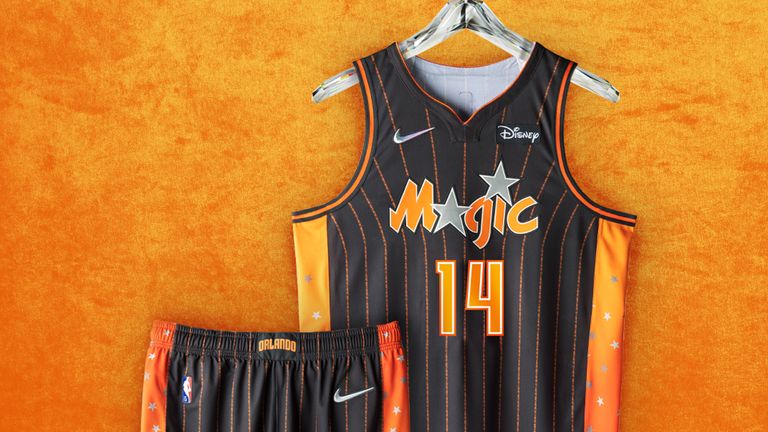
The black and orange - which represents Florida's citrus heritage and Orange County within the state - will divide opinion but at least they're trying something. Only this low because the starry side panels are a bit too much. Acceptable for children's wrapping paper, less than ideal for a basketball jersey.
22. Portland Trail Blazers
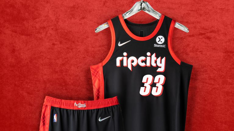
It's impossible to go wrong with Portland's red and black colour scheme but this is completely unimaginative and risk averse, the exact opposite of Damian Lillard's three-point shot selection. Disappointing to say the least from the team with the best current logo in the league.
21. Los Angeles Lakers
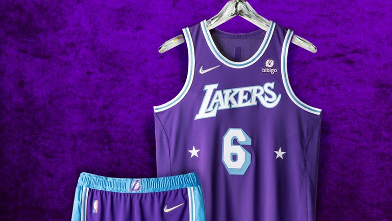
You're the Los Angeles Lakers. Why look like the Sacramento Kings?
20. Sacramento Kings
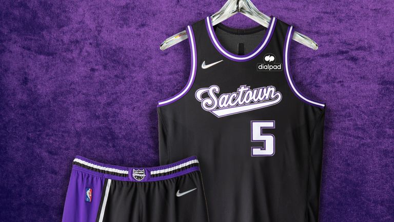
You actually are the Sacramento Kings. Why aren't you trying a bit harder to get people to like you?
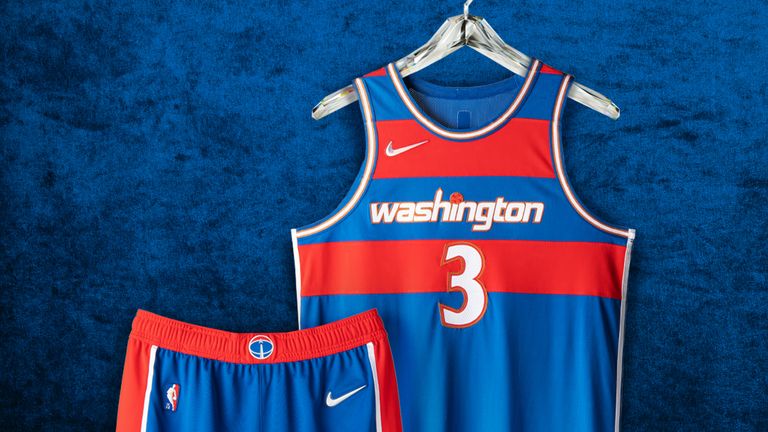
19. Washington Wizards
A decent nod to the Washington Bullets era but one that leaves me unmoved. Exactly like every Wizards team I've ever seen.
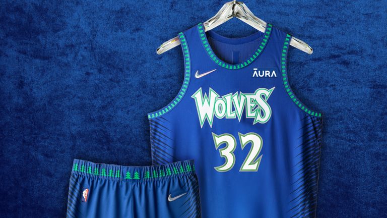
18. Minnesota Timberwolves
The throwback font and trees are great but this would have been much better in black rather than blue. And with prime Kevin Garnett wearing it.
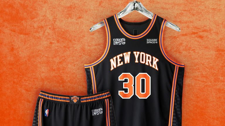
17. New York Knicks
Before the hardcore Knicks fans take to the streets to 'Bing Bong' me I'd just like to assure them that there are no bad jerseys at this point in the list. This is clean, with bold colours. It's just lacking a bit of the mania and drama that truly makes the Knicks, the Knicks
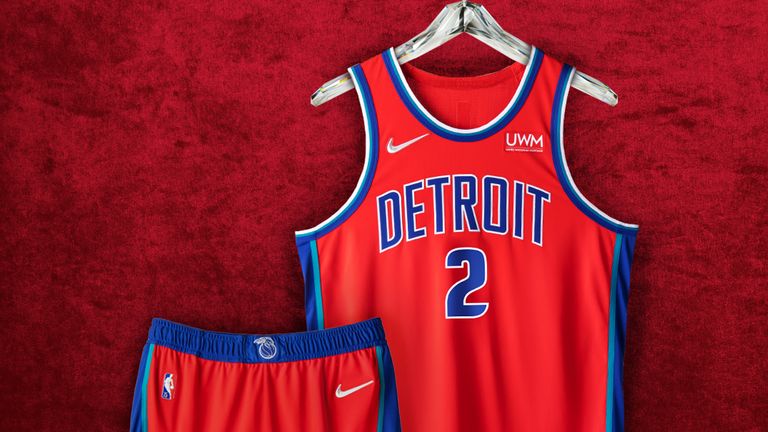
16. Detroit Pistons
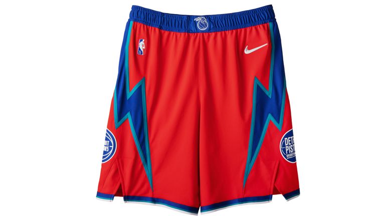
No frills and nothing fancy but undeniably very Detroit. The addition of teal taping between the traditional red and blue is a classy feature, as are the lightning bolts on the shirts (even if they don't quite match those of a jersey we'll see later).
Overall, this is a uniform worthy of the 'Bad Boy' Pistons, if not quite Dennis Rodman alone.
15. Milwaukee Bucks
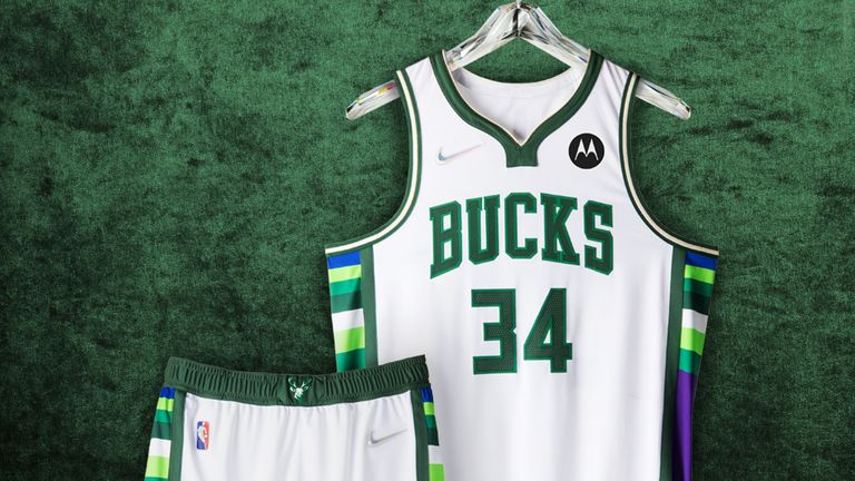
The wide array of colour on this jersey shouldn't work, but it does thanks to the purple - one of the team's primary colours during the late 1990s and early 2000s - tying everything together.
The thought of Giannis rocking this is enough to bump it into the top half.
14. Miami Heat
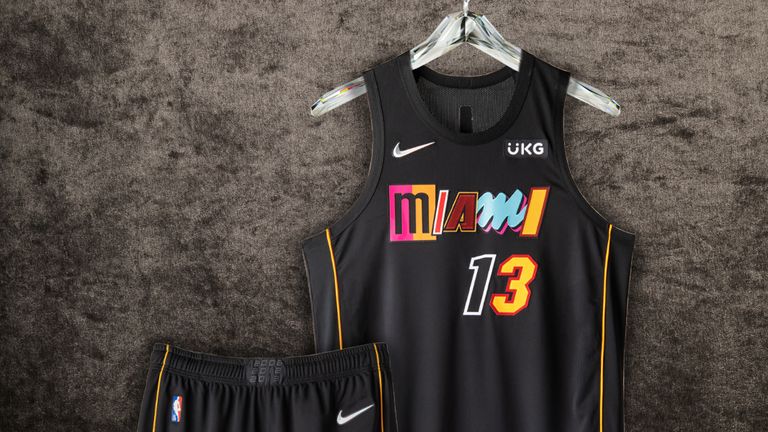
How you feel about Miami's City Edition uniform will depend entirely on how much you like the ransom note-like 'Mashup' lettering and numbering that adorns the front.
Against all odds, I actually think they've pulled it off, if only thanks to the minimalist design of the rest of the kit. It's a unique way to honour the different eras and styles of Miami basketball; even if it doesn't match their unbeatable 'Vice' jerseys.
The thin stripes down the sides are a nod to the yellow ropes brought out seconds before Ray Allen's three-pointer during the 2013 NBA Finals, apparently.
13. Denver Nuggets
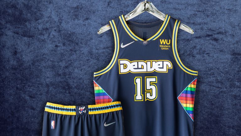
Maxie the Miner (their original mascot), the rainbow Tetris pattern and funky waistband all elevate Denver's dull base colour into one of the most interesting designs here. The Nuggets are nothing if not fun and unique, so this should come as no surprise.
Nikola Jokic launching passes from impossible angles in this? Yes please.
12. Los Angeles Clippers
Unlike Denver, the Clippers jersey all comes down to a baby blue, white and orange scheme that pops like a Paul George jumper and makes this jersey the brightest of the whole lot.
The Buffalo Braves logo on the waistband of the shorts looks to me like a stamp of approval on this vibrant tribute to the Clippers' origins.
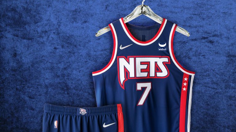
11. Brooklyn Nets
Brooklyn's effort manages to touch on every significant era in Nets history and looks great to boot. The best of all the navy, blue and red efforts.
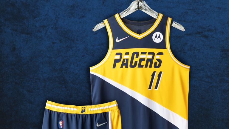
10. Indiana Pacers
The 1987 Pacers wordmark is the centrepiece here, but this is just a beautiful kit from top to bottom.
Bobby 'Slick' Leonard's catchphrase "Boom Baby" sits above the Nike label on the jersey - a subtle hat tip for his three ABA championships with the franchise.
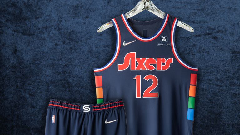
9. Philadelphia 76ers
The Sixers' City Edition jersey pays homage to the Philadelphia Spectrum, which was nicknamed "America's Showplace" and served as their home from 1967 up until 1996. Fittingly, the combination of retro font and simple block colours is pure 70s disco.
Fun fact, the four colours represent each of Philly's four major sports teams: 76ers (blue), Philadelphia Eagles (green), Philadelphia Flyers (orange) and Philadelphia Phillies (red). A future classic.
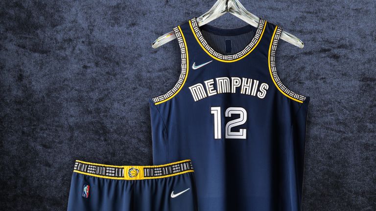
8. Memphis Grizzlies
I'm a sucker for absolutely every Grizzlies uniform and this one is no different. Ja Morant on the back of this one please, Santa.
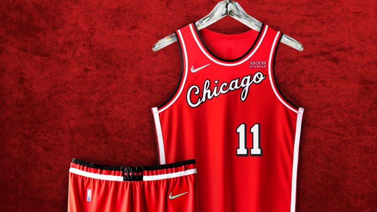
7. Chicago Bulls
The 'Chicago' script font of the 1980s is the best use of lettering on the list. Stunning. And take note Portland: this is how you do red and black.
6. Houston Rockets
The Rockets throw it back with their iconic pinstripes from the 1990s and early 2000s.
Looking at this jersey and picturing a baby-faced Yao Ming or Steve Francis is the key to appreciating it. You might even remember Hakeem Olajuwon, Charles Barkley and - very briefly - Scottie Pippen donning this look in Houston, too.
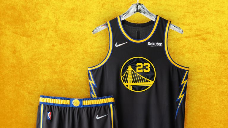
5. Golden State Warriors
The Warriors effort just has everything you want in a uniform.
Lightning bolts? Check. Striking colourway? Check. Hidden water drops on the jersey and shorts honouring two of the greatest shooters to ever take to the floor? Double check. The Splash Brothers will love this.
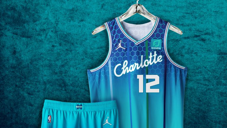
4. Charlotte Hornets
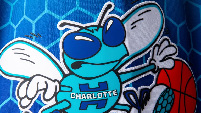
The 'Charlotte' font is completely new. The teal, honeycomb and classic Hornets logo on the shorts are all very familiar. Simply put, it's impossible not to love Charlotte's City Edition.
I would wear anything with that angry cartoon wasp on, honestly.
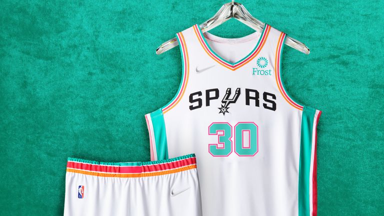
3. San Antonio Spurs
Whenever the Spurs get their 'Fiesta' on it's always a W.
The team they have at the moment is far from their best, but it's OK: sit back, close your eyes and let the fuzzy memory of this daring colourway take you back to better days in San Antonio - particularly that first championship in 1999.
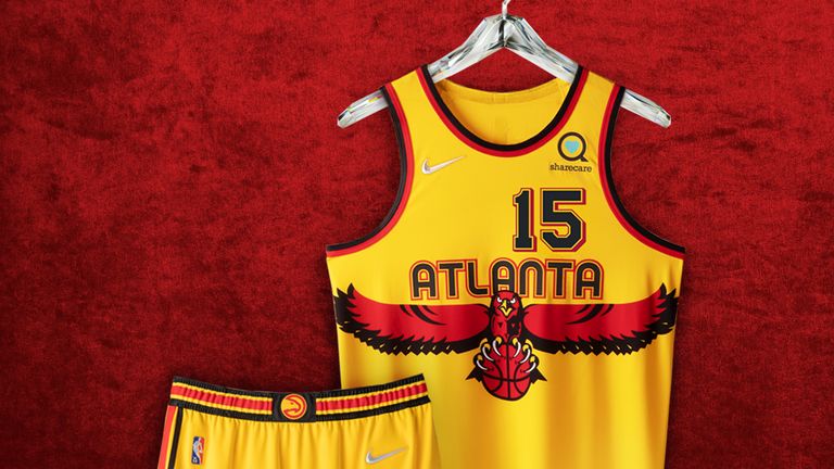
2. Atlanta Hawks
The shade of yellow, rounded font and soaring hawk stretched across the uniform are all perfect. I would not change a thing, but just like the Eastern Conference Finals last season, Atlanta have been edged out by marginally superior opposition.
Another one that will only look better and better as it ages.
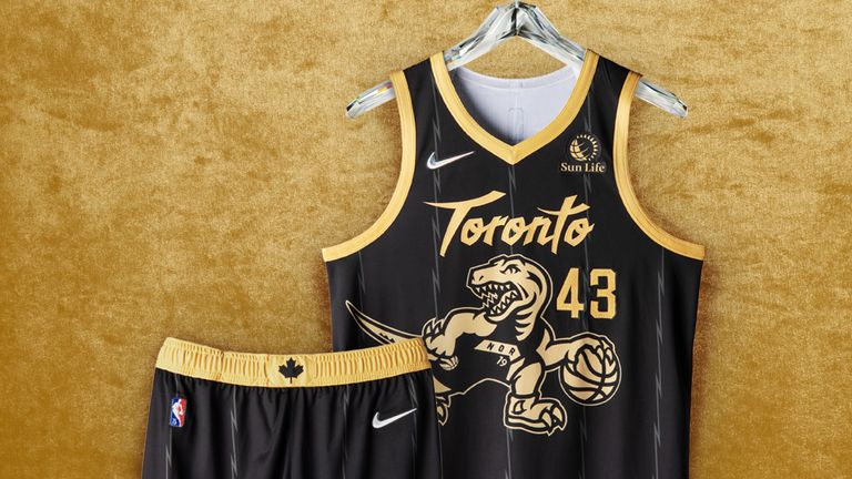
1. Toronto Raptors
Toronto's dino continues to reign supreme. Whichever way you look at it, it's just impossible to compete with a dinosaur dribbling a basketball. We're all children at heart and this is what we want on our clothing. That's fact. It's science.
Put it in black and gold, add faint razor wire striping and a single maple leaf on the shorts and it looks even better.
Congratulations to the Toronto Raptors, who officially possess the single best City Edition jersey in the NBA. And well done on drafting Scottie Barnes, too.
