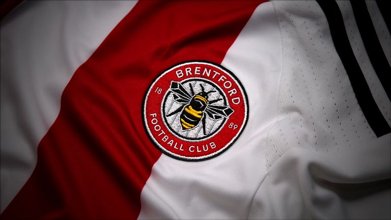
Brentford redesign club crest after 23 years ready for next season
Thursday 10 November 2016 18:29, UK
Brentford have redesigned their club crest for the first time in 23 years.
A new, simplified design incorporating a single honeybee over a red ring, which includes the Bees' name and its founding year of 1889, will replace the previous design made in 1993.
In an attempt to provide a more "recognisable, iconic and practical to use" logo, the west London club have done away with the shield shape and Middlesex arms of the old design, and will bring in the new one for the 2017-18 season.
Brentford chief executive Mark Devlin said: "It's always an emotive subject when a club decides to change something as important as its crest but part of our club's philosophy has always been about moving with the times and improving as we go.
"Like everything we do at Brentford, this isn't change for change's sake, there is always a reason behind it and that reason is to give the club a clearer and more recognisable crest that will help us grow off the field.
"We all recognise the old crest wasn't really fit for purpose in a digital age, where impact has to be instant and that's part of the reason we've changed.
"This is not revolution, it's part of the club's evolution. In the next few years, we will be taking huge strides with the move to a new stadium and the change of crest to a simpler, more striking image is part of that progress."


